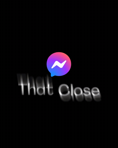
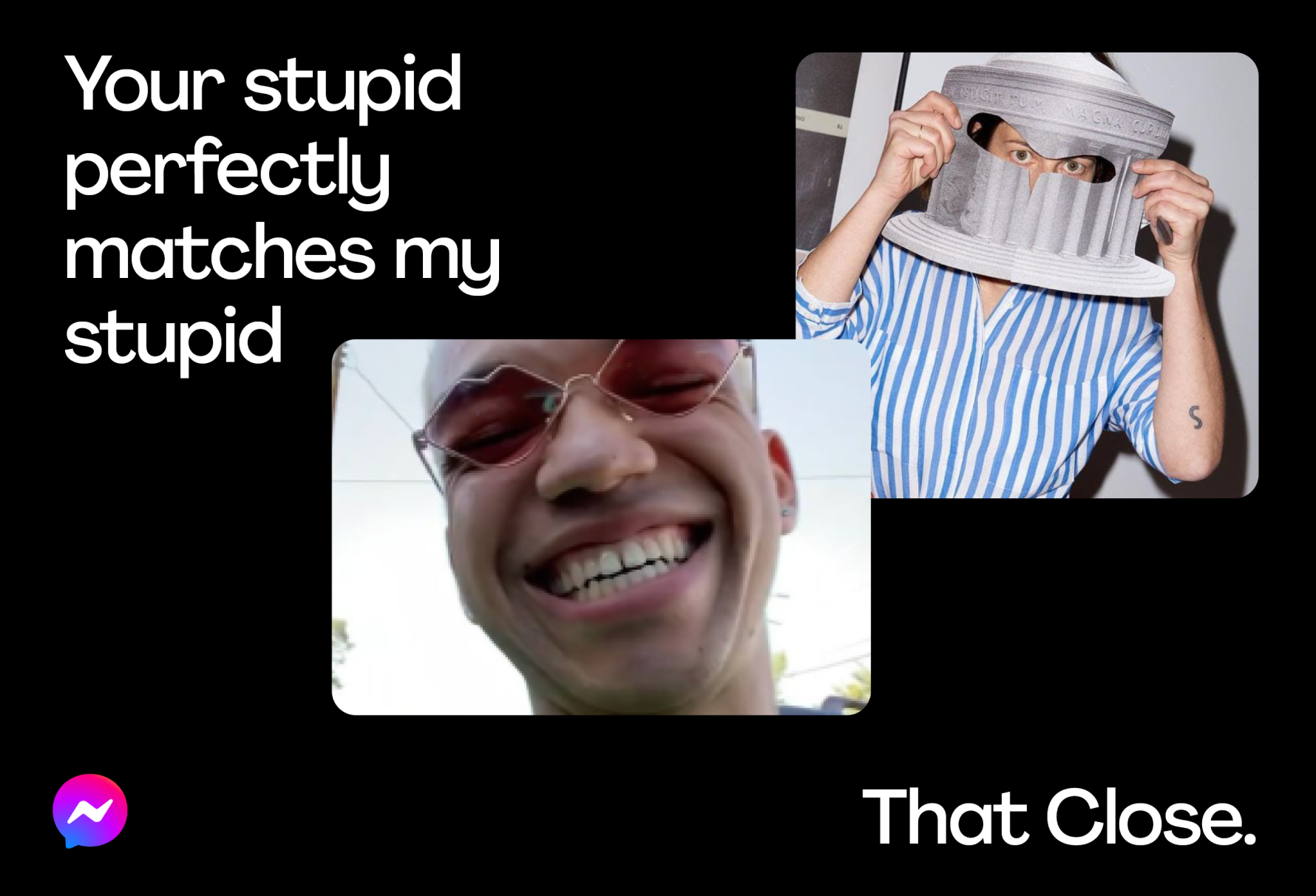
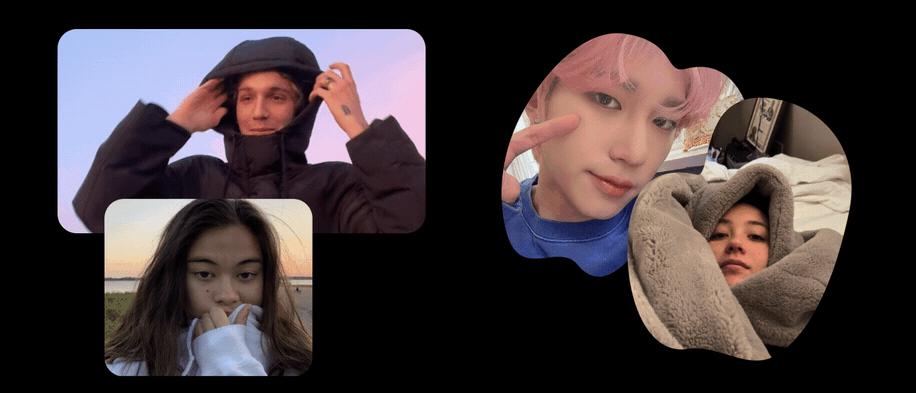
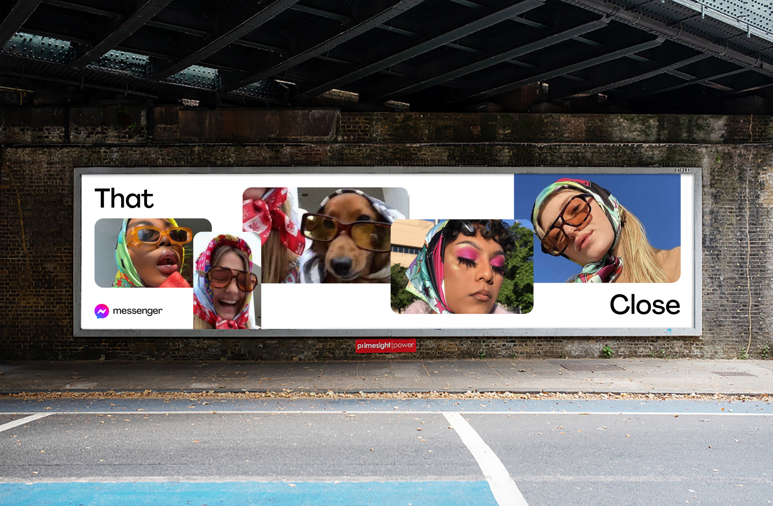
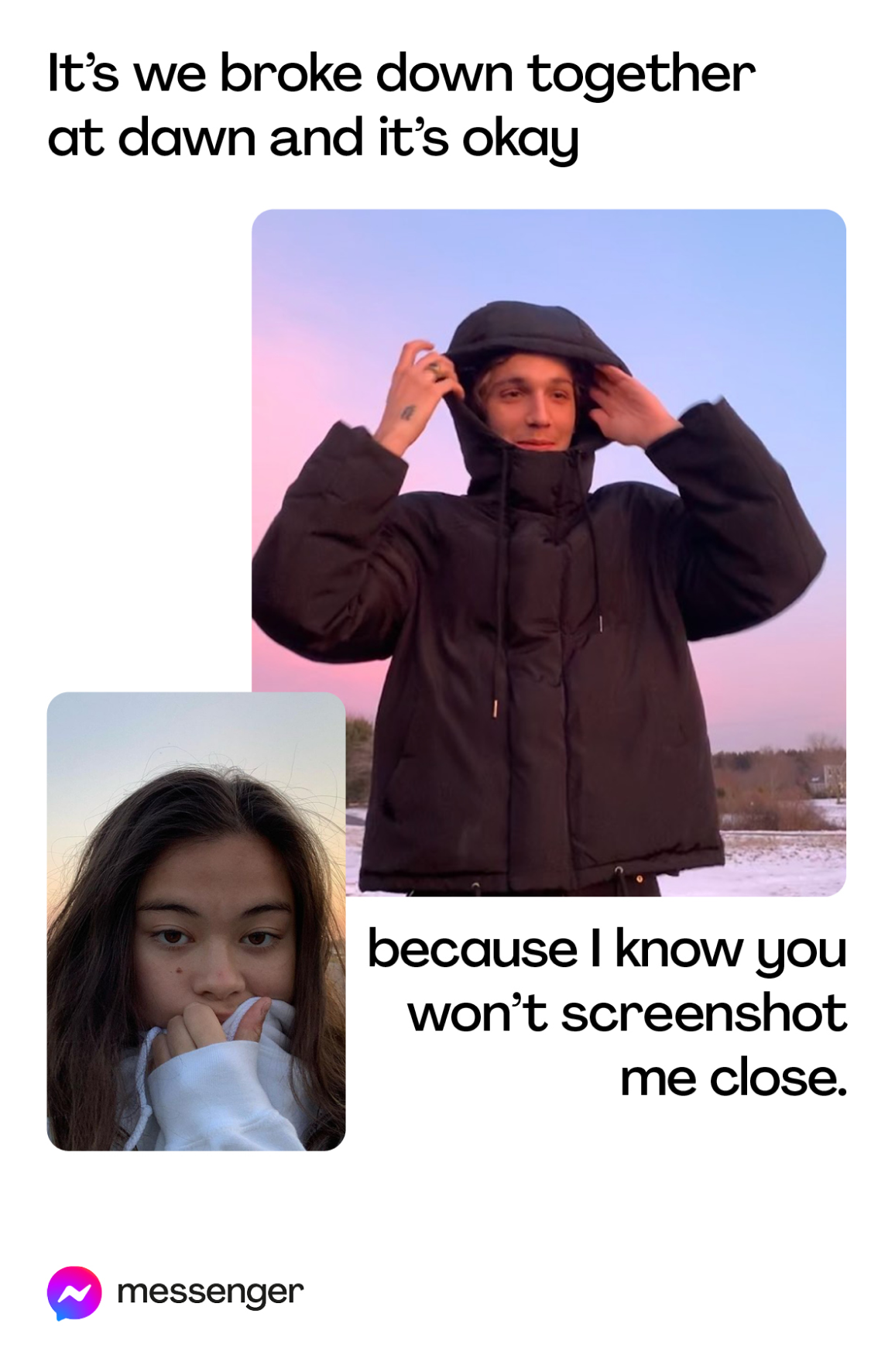
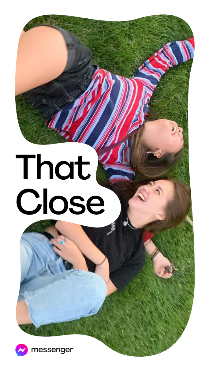
“That Close” brand identity
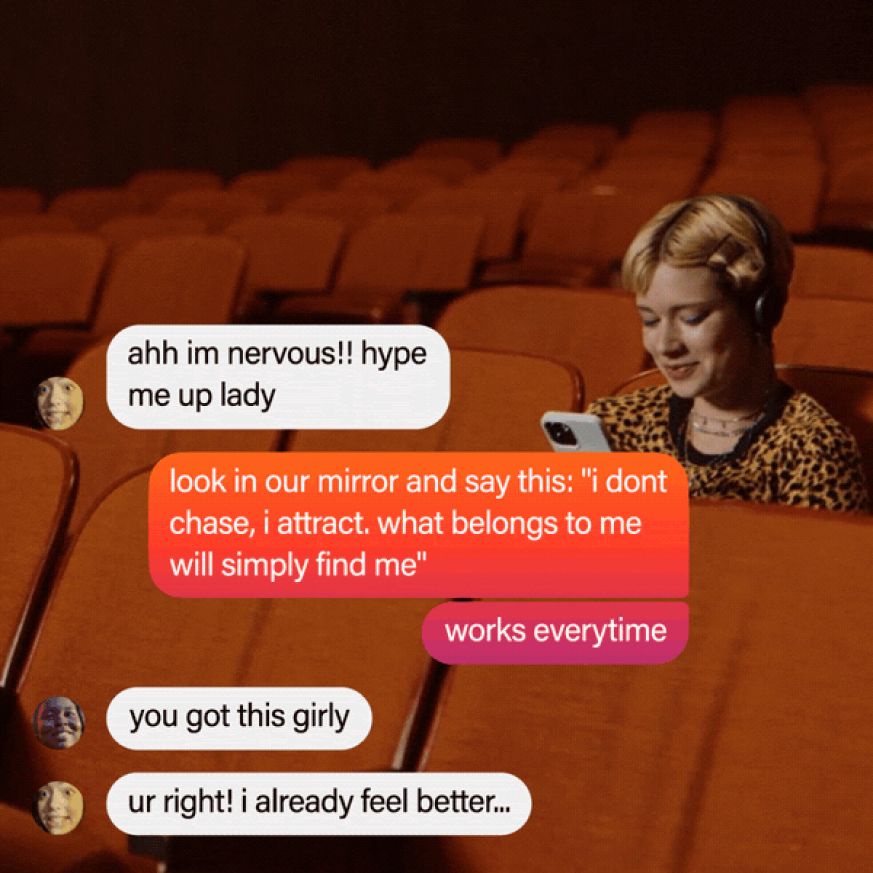
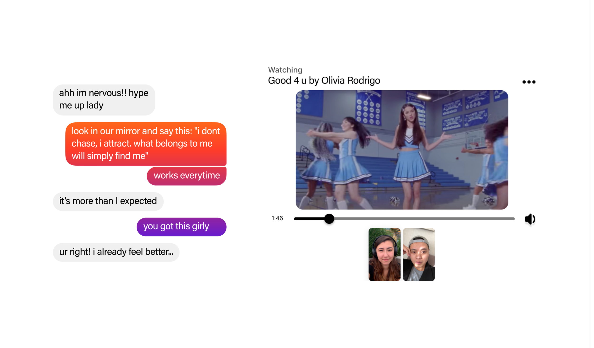
The goal of Messenger's new integrated campaign visual language was to create a rich and flexible system that brought to life the brands new positioning as a space that facilitates genuine connections between close friends.
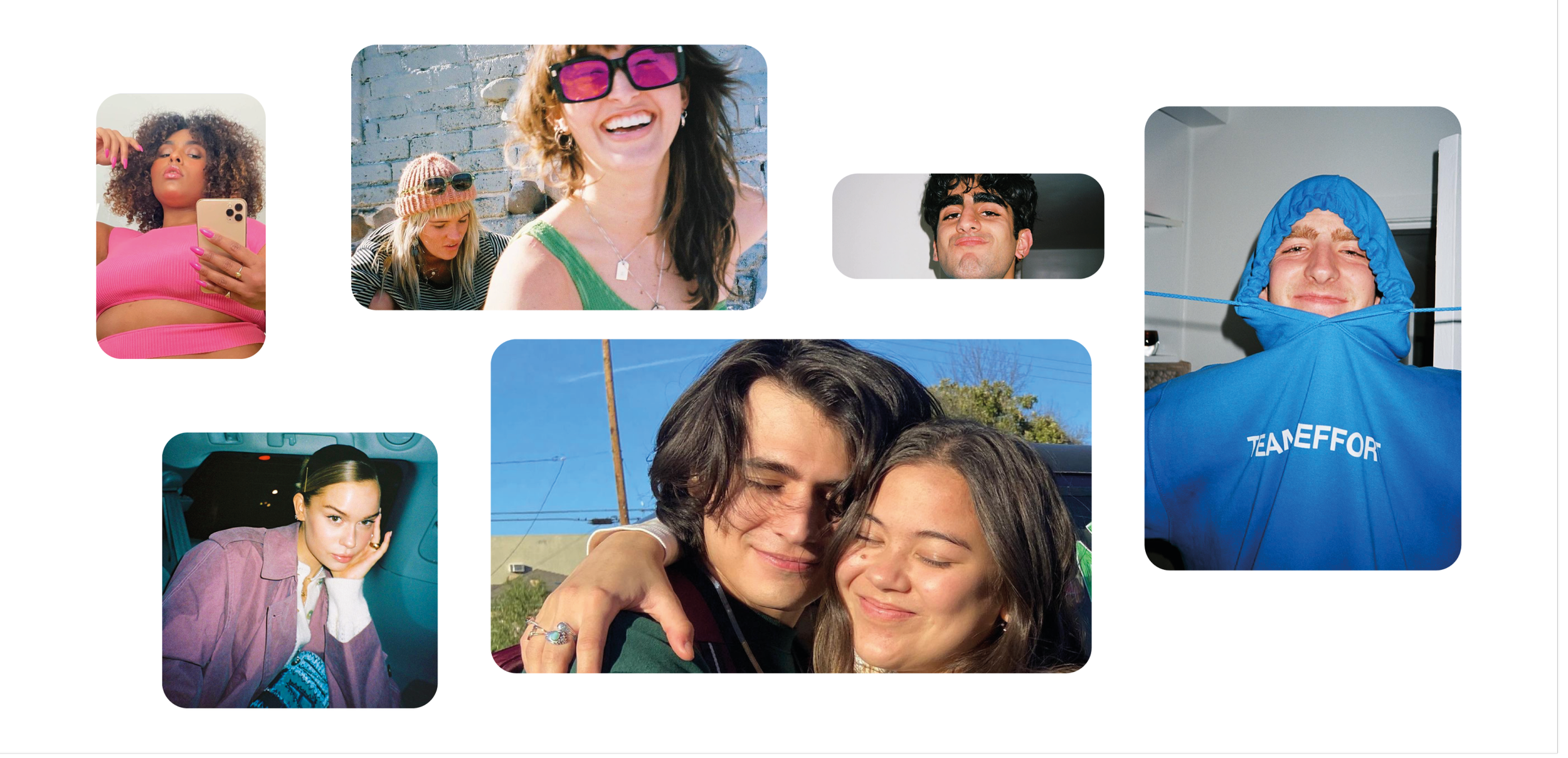
Aimed at a Gen-Z audience, the identity is grounded on the principal of fluidity as it reflects the dynamic ebb and flow of their communication style. The system was built to celebrate the millions of micro interactions Messenger users have every day that bring them closer to their people.
+ CLIENT - MESSENGER
+ AGENCY - IN-HOUSE (CX) X MOTHER LONDON
+ ROLE - Design Lead
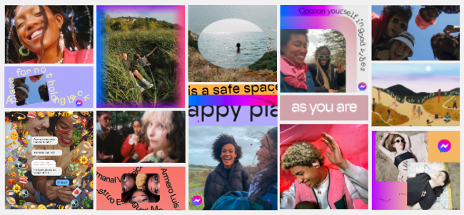
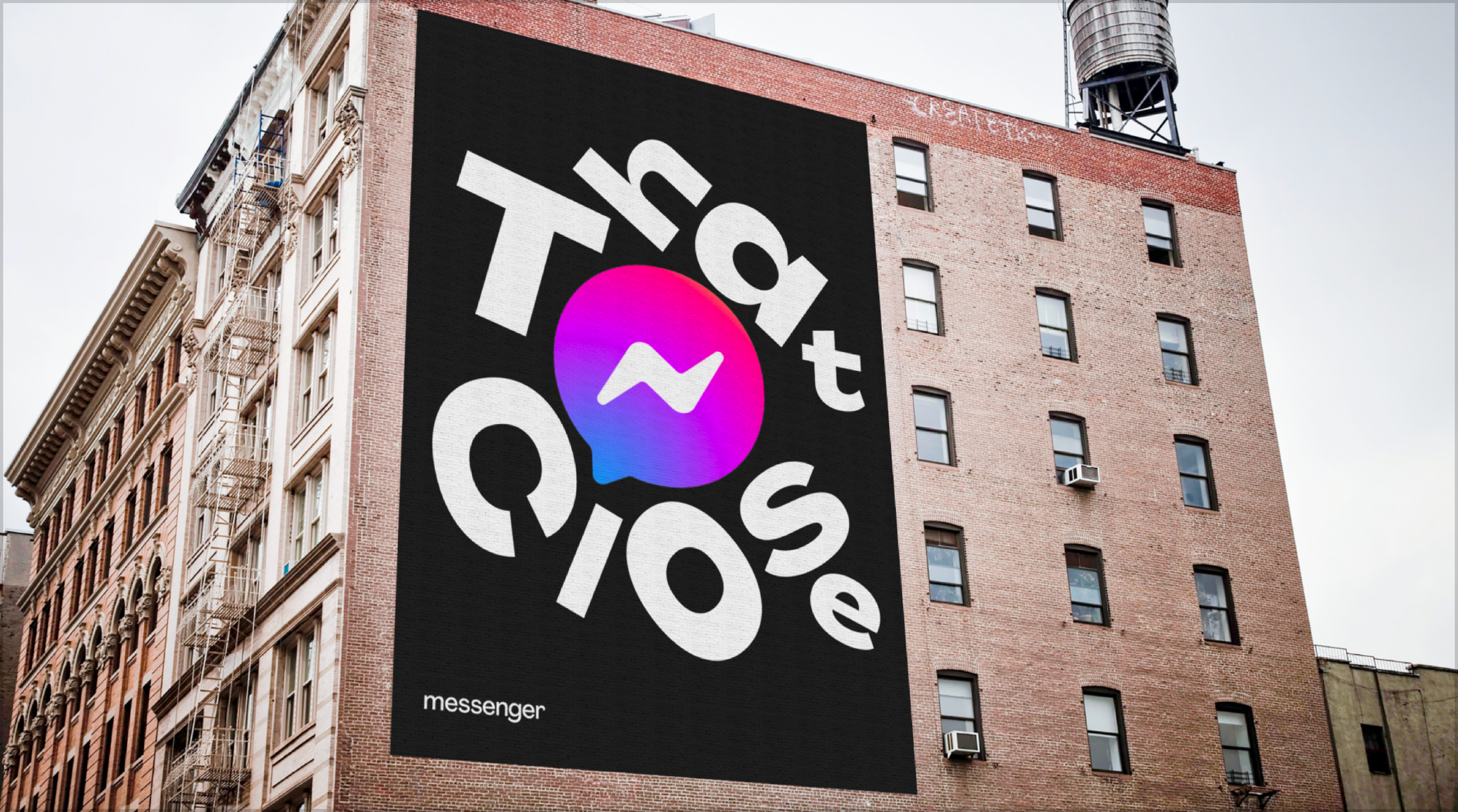
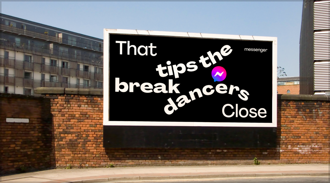
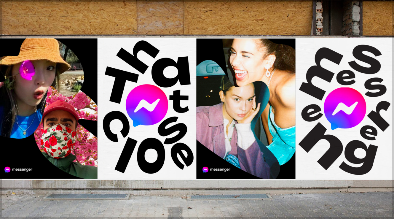
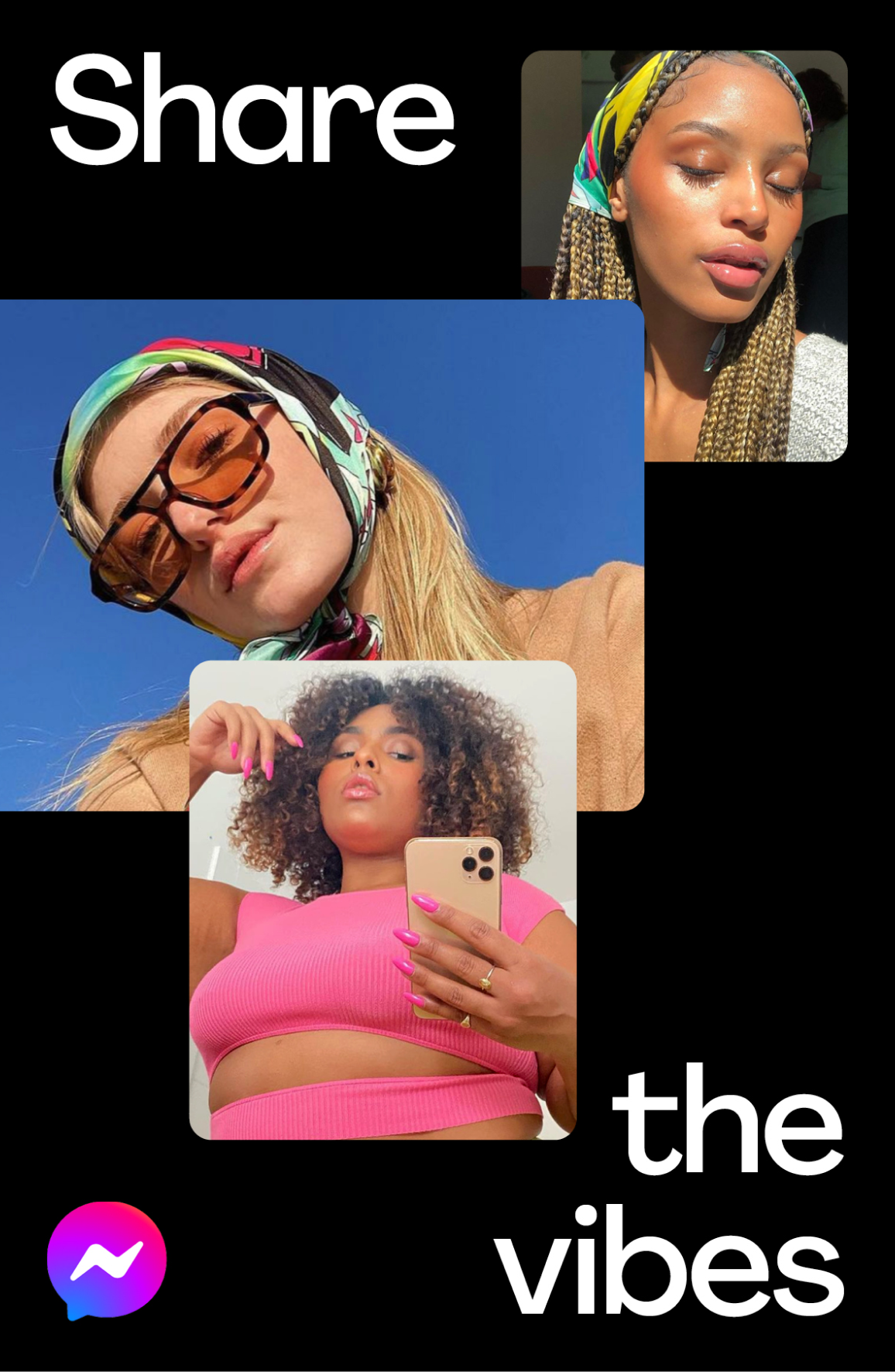
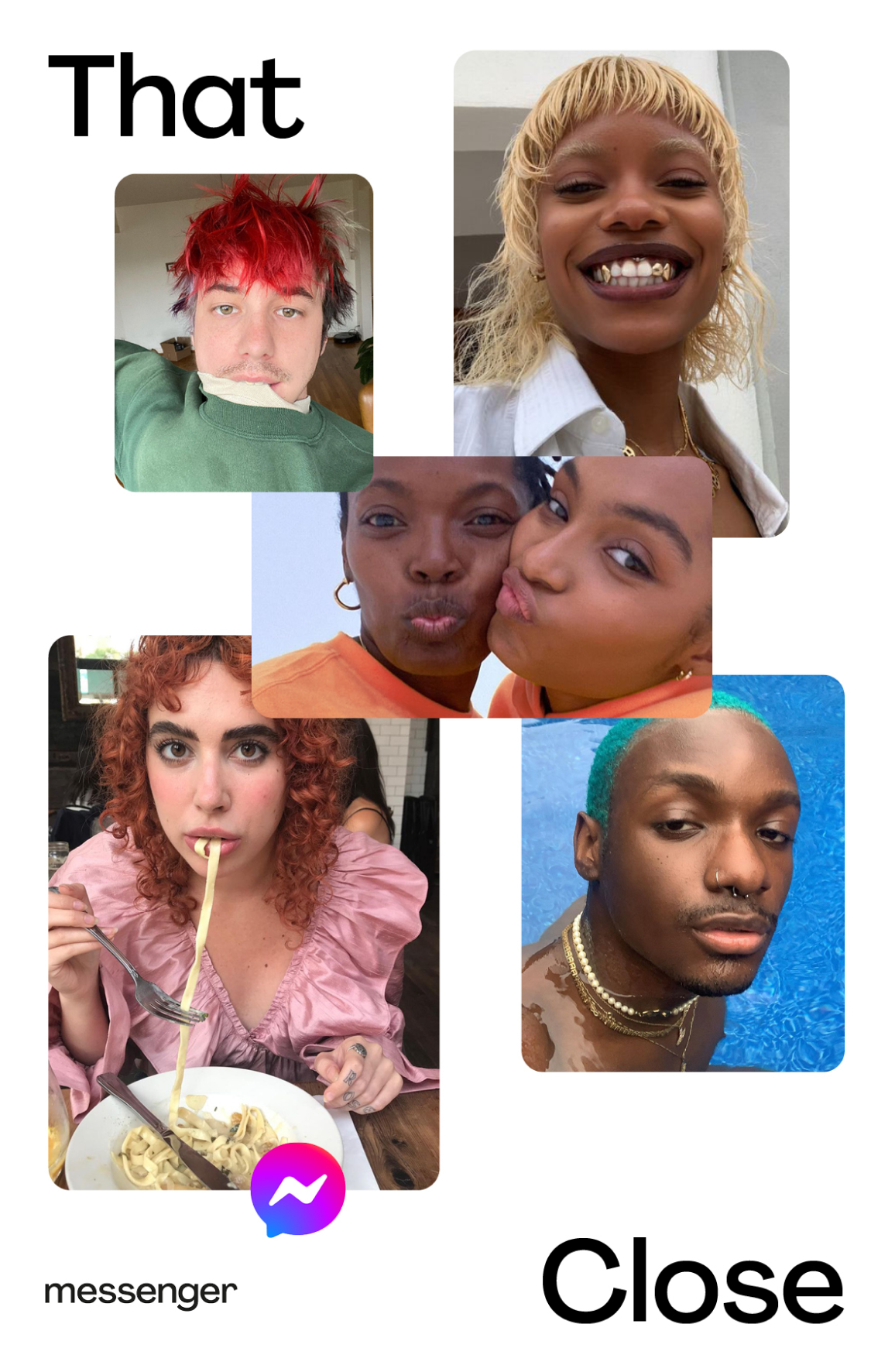
That Close Press
〰️
That Close Press 〰️


The Approach
Concept development process started with working closely with both product and brand strategy team to identity insights principles that speak to the natural way our users interact with Messenger. Through the research phase we were able to define the following design principles and explored four design territories.
Fluid –– a space with no boundaries or limits, where conversations and experiences seamlessly flow amongst close friends from one thing to the next with an ease (and a magic).
Playful –– imaginative, surprising and wonderfully weird, bringing a youthful spirit
to the space
Supportive –– inclusive and approachable, they feel guided and safe in their exploration
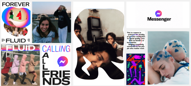
From four, the territories were narrowed down to two and ulrimtaley down to one “Forever Fluid”. It was the team recommendation n and aligned with our leadership team pre-defined criteria.
The Idea
Forever Fluid
The role of the visual system is to create a rich language that brings to life Messenger's role as a space that facilitates genuine connections between close friends. Everything in this language starts with an interaction that triggers a dynamic conversation. It’s these conversations that form the basis of close connections and influence who we are.
Our system is built on the ebb and flow between conversation and connection; fluid yet intentional actions that express the way people interact, and which define the Messenger visual language.
System Fundamentals


Type mirrors chat
Inspired by the left/right alignment of the Messenger Chat thread, the foundation of our typography is grounded in this visual principal, creating a clear through-line between product and marketing.

Inspired by product
The foundation of all graphic devices in the system are born from the platform itself. Depending on the intention of each execution, the shapes combine to become more fluid, connected and expressive.

Mild to wild
In celebration of the spirit and fluidity of our closest connections, our system explores a range of expressions from mild to wild. From laid back and relaxed to spontaneous and excited, Messenger represents closeness in all shapes and forms.
Core Elements


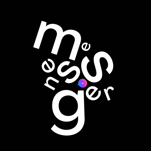
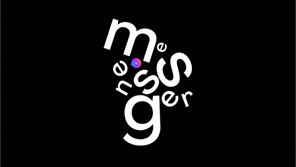
Wordmark & Type
The updated wordmark reflects the Messenger brand personality; accessible, welcoming and connected.
We dropped the capital M to reflect the brand's role as an approachable host. We tightened the tracking to denote closeness, and made bespoke adjustments to individual characters that help communicate the feeling as if they ‘talk’ to one another.

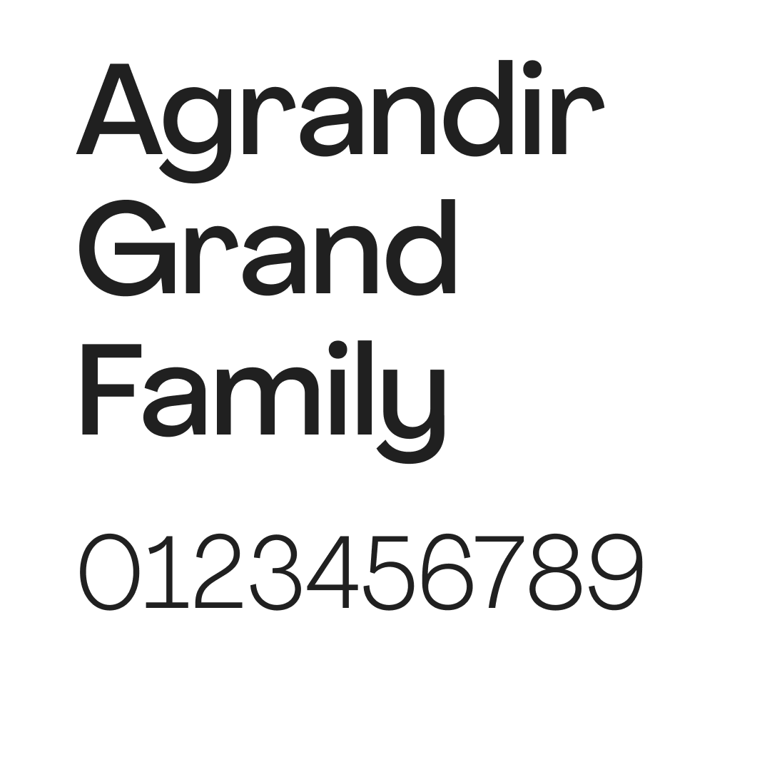
Expressive and Conversations Typeface
The new brand typeface is Agrandir With its curves and playful shapes, it’s full of character and imperfect quirks, which is unique in our category. Its round glyphs give it a friendly, approachable and human look, which pairs perfectly with our playful brand personality.
Graphic Device
Inspired by Messenger’s signature rounded corners, the system uses graphic devices to contain the art direction. Their role is to express the fluid and dynamic conversations and experiences that happen on Messenger, bringing to life a social universe where people grow closer.
The shapes fit into two categories: mild and wild, each bringing to life full spectrum of our brand personality.
Mild Shapes
The ‘mild’ shapes are directly inspired by the rounded corners of Messenger’s UI. They are used to communicate the less expressive end of our spectrum or to accurately represent UI in practice

Wild Shapes
With ‘wild’ shapes, we take the fluidity and expression a step further. These forms represent the energy and uniqueness of the conversations and experiences that happen on Messenger. They are intended to communicate high-energy, celebratory messages and in applications where we want to dial up the connections between users.

Motion

Motion is a brilliant tool for adding energy and dynamism to our system, bringing to life the fluid, responsive side of Messenger's personality and reflecting the ways the community experiences connection and closeness as they use the platform.
The motion system reflects this fluidity and spirit as well as supporting content and storytelling.

Conversation and Connection
Through reactive, connecting elements the system can replicate the fluid interactions of users. Just like in human conversation, our elements respond to each other, with an emphasis on coming together. This gives us a basis for storytelling through motion.

Shift & Transform
In this space, motion allows our design elements to adapt and transform their form and appearance. Shapes shift and warp, while type scales and dances.

No Boundries
Through elastic and directional movement, we can connect our principles, presenting closeness and connection. This allows our brand to live in a world that feels limitless.

Inspired by product
The motion system takes inspiration from the Messenger product in how it moves and eases. This allows us to create subconscious connective thread for anyone who interacts with the product or is served up any marketing from the brand.